happen to your career: design and branding it deserves.
Happen to Your Career has been creating incredible content and building their brand and business for years. Then, like so many others, they looked up one day and realized that they’d outgrown their initial design choices and felt like their site was being held together with chewing gum and toothpicks.

the problem.
When we first met with the good people at Happen to Your Career, one of the initial concerns they brought up was how dated their website felt to them and how slow it was running.
Like an old house, they’d been “remodeling” it for years, but using different people, tools, and copy and pasted code snippets from the Internet each time. We all know how this goes, you’re way too busy, you know, running and growing your business, to spend significant thought and effort on things like page load time and clean code.
They were also not happy at all with the overall design and branding of their website and other digital assets. The message of Happen to Your Career was so positive, hopeful, and future focused … and their branding just didn’t carry that message to the world.
Happen to Your Career (HTYC) is good people. This is where we arrived on the scene to help solve these problems with them
the process.
We began by performing an extensive (though not painful) audit of HTYC’s content, content structure, and art assets. This included several great conversations with the team, about what they thought their branding and site issues were, as well as their hopes and desires for the future.
First, structure. We worked with several members of the team to eventually determine what the biggest structural issues with the site and content were. Early on, it became clear that — as far their audience went — HTYC was essentially running two sites in one! This would require serious thought about how to intelligently and intuitively present and deliver the right content to the right people at the right time.
Next, design. It had been years since they’d spent any significant time thinking about the brand’s design. Though it appeared to be a big job, the pure electricity of the brand and the people at HTYC made our initial research and choices relatively easy. It is a brand of hope and future dreams, of possibilities and opportunity. We went with this, using their type solution logo as an anchor, eventually arriving at color, typography, and layout choices that thrilled our client.
Finally, development. Early in our conversations and research, it became clear that, to do it right, the HTYC site would need to be rebuilt from the ground up, and that this would likely require a serious manual migration of all content. We also came to the conclusion that, due to the “two sites” issue discovered in the structural research above, we would need to execute a post types system that would allow content to flow to site visitors as needed.
And how did we get there? Read on ..
the solution.
With notes, sketches, and color palettes in hand, we went to work. To do justice to such a vibrant brand was a challenge we relished, and the outcome, we think, was nothing short of breathtaking.
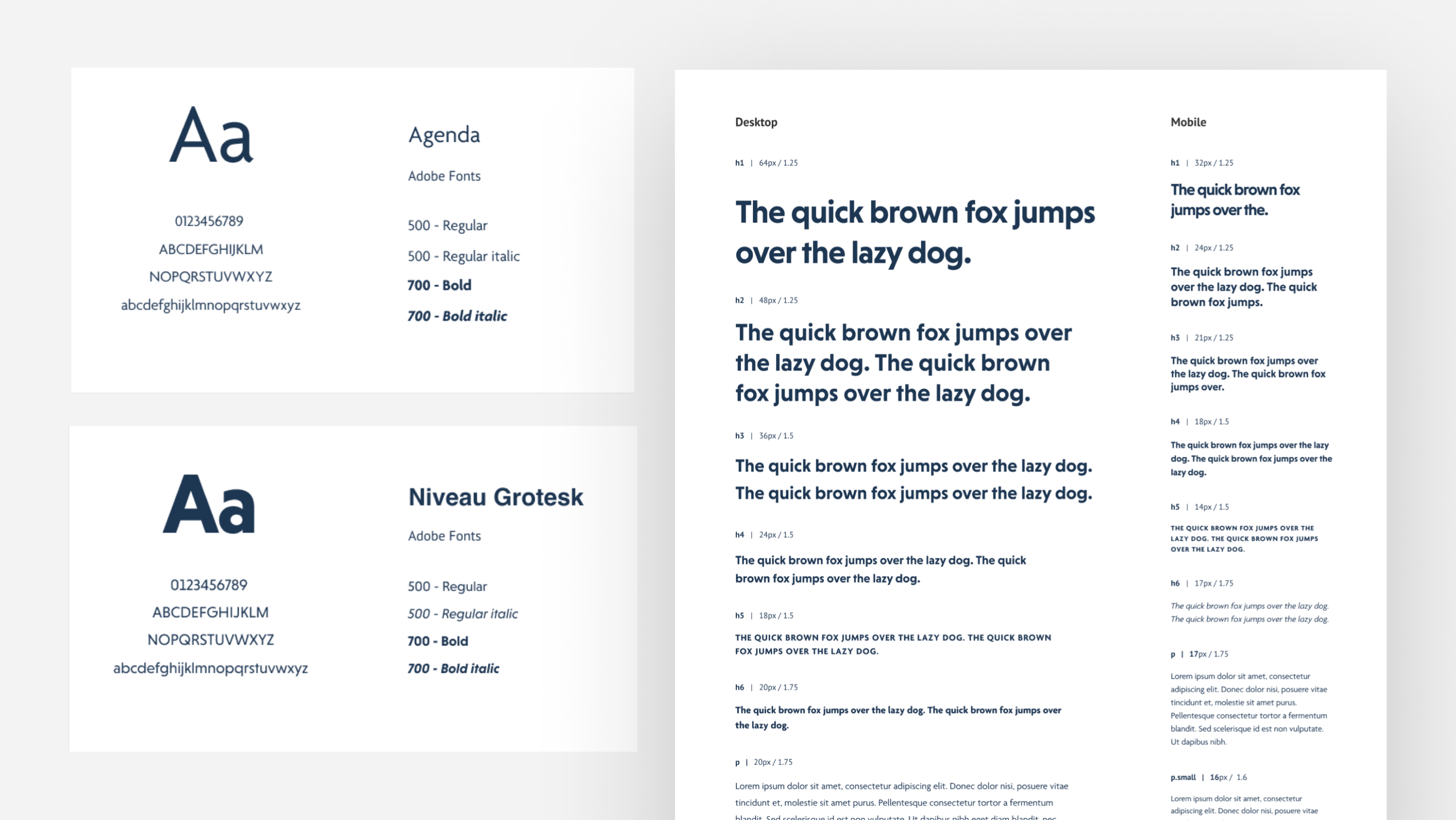
Let’s start with design. As stated above, the colorful, optimistic, and future-looking promise of HTYC had to be captured. We felt the best way to do this was through the use of primary and near-primary colors and simple shapes like the triangle.
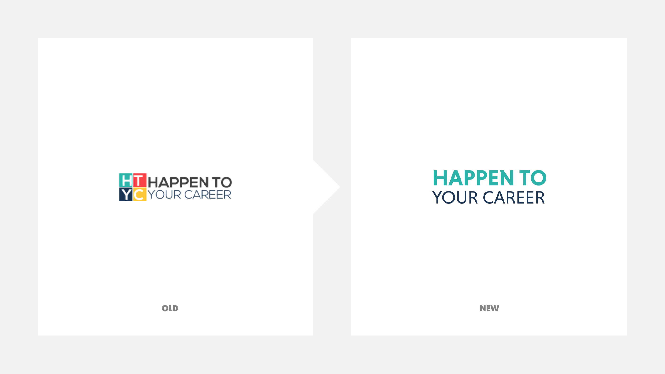
The anchoring element (and the only branding we did not create from scratch) was the logo, though we did update it slightly:
We also wanted quite a bit of whitespace in the design, allowing it to breath and not seem cluttered at all:
And finally, there’s the layout of the site, which is directly tied to the structural choices we made back in the interview and research process.
Our goal was to structure HTYC’s new site in a way that makes sense for both their visitors and their business goals. We accomplished this by simply presenting their most pressing goals very clearly in several prominent places.
For instance, the top navigation menu of the site:

Which follows an only slightly different set of presented offers as you scroll down the homepage:
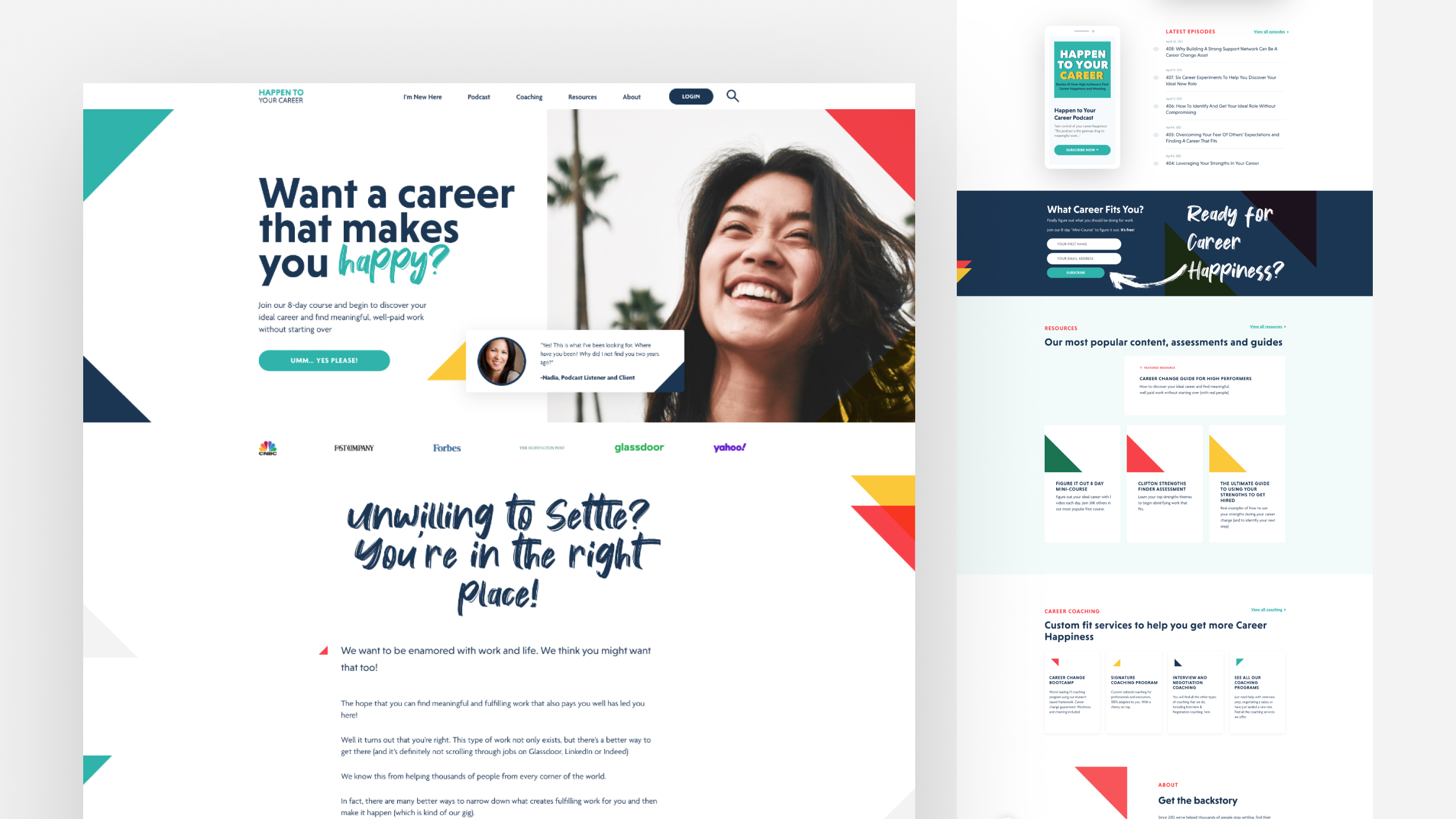
Again, the idea here is not to overload the visitor with information, but to strategically place the right information in the right place, excluding nearly everything else. We, with HTYC, decided what was most important, then presented it clearly.
This process allows the visitor to find exactly what they’re looking for, while simultaneously supporting HTYC’s most important business goals: join the email list, follow the podcast, sign up for coaching services, and dive into their incredible resources.
Beyond the homepage, we made decisions about the most important pages that HTYC needed, either in support of click throughs from the homepage and/or as standalone sales pages.
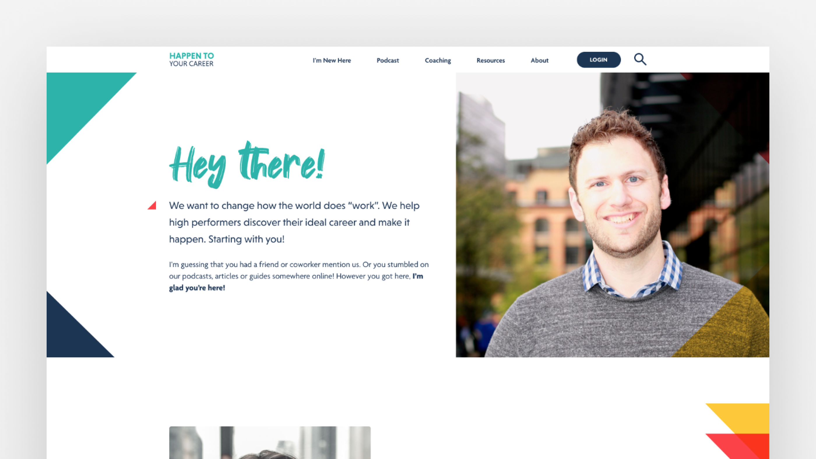
They needed a “New Here” page so that visitors could easily, at-a-glance review what they offer and potentially take one step closer to engaging with them:
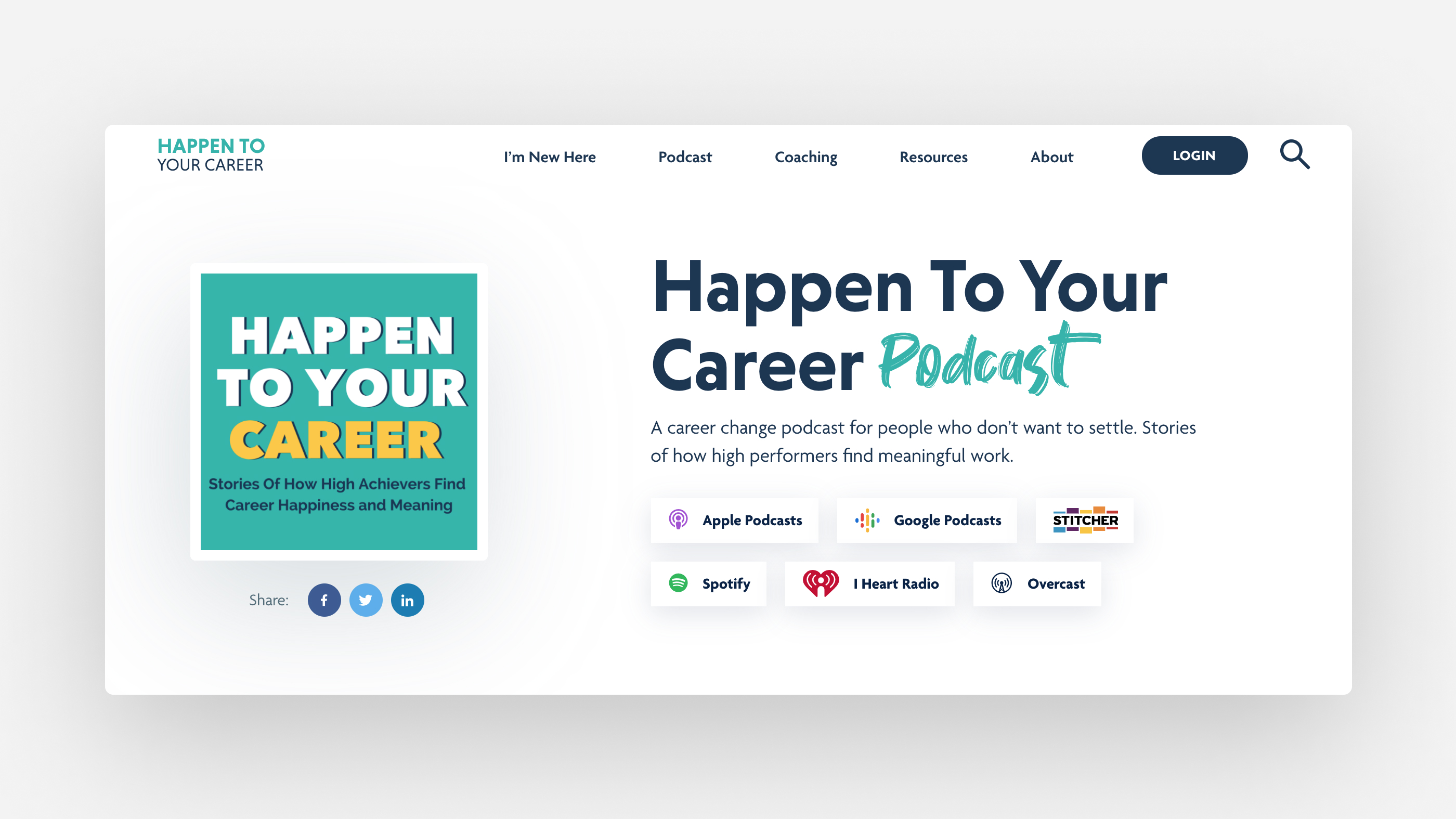
They needed a dedicated podcast page and a way for people to find the right type of podcast for them. Our solution to that was particularly elegant
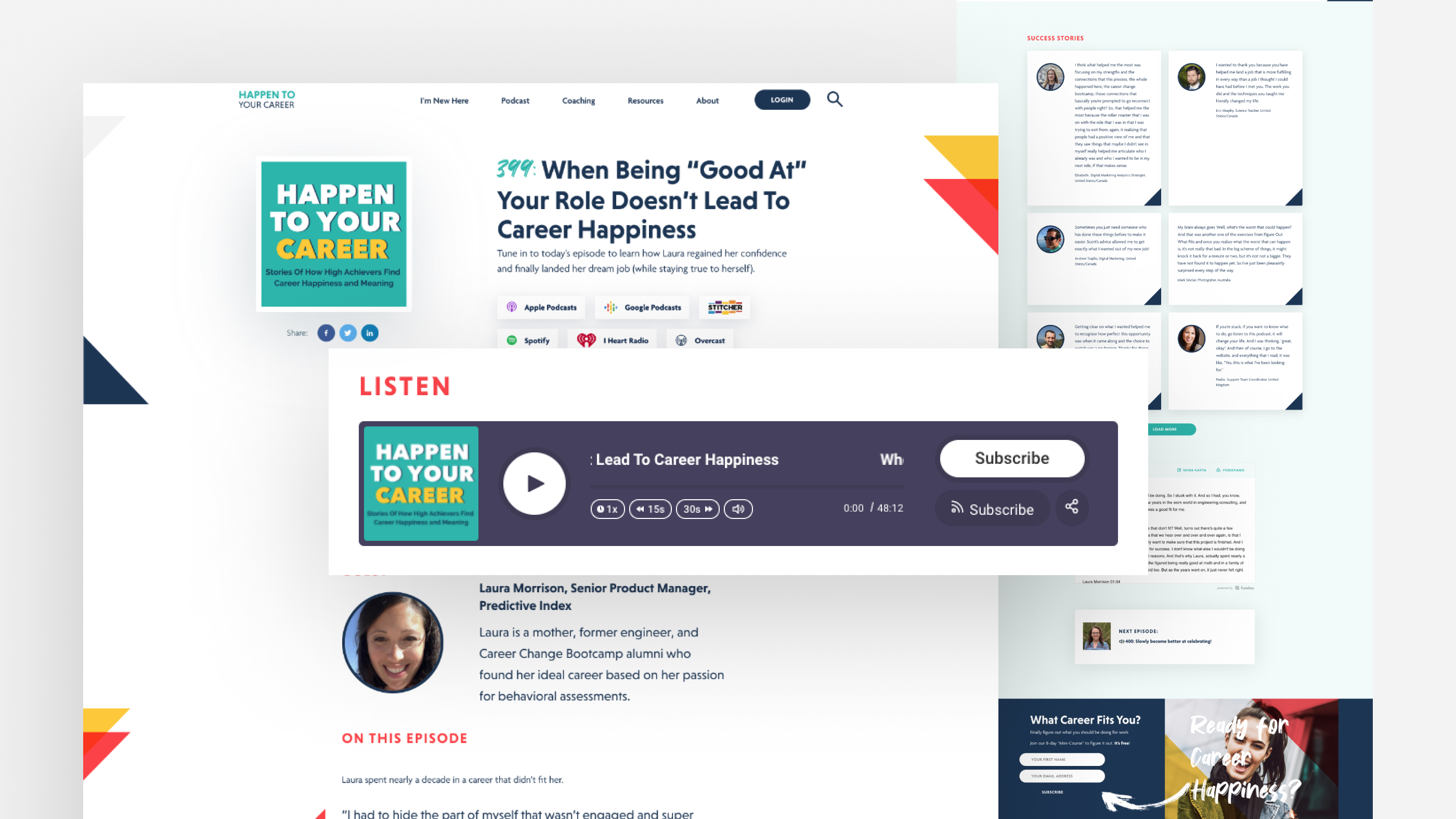
They needed pages designed for individual episodes of the podcast:
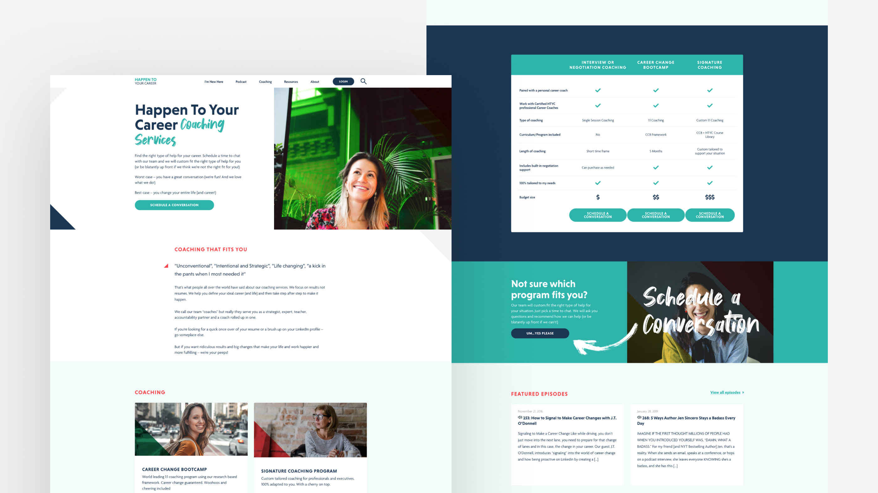
Dedicated landing/sales pages for their multiple offerings:
We didn’t there. There are many other pages and elements we designed for HYTC, when you have time, head over and enjoy the site for yourself!
And last, but certainly not least, we need to talk briefly about development. This aspect of our work with HTYC was a large undertaking in many regards, but the result was immensely satisfying.
Back to the top of this case study, remember that one of HTYC’s main concerns was how their website was performing. We would ultimately decide to start over from scratch, on a brand new server, from the ground up.
Whenever you make a radical development decision like this, you don’t take it lightly. We knew that this decision would mean exponentially more work, more strategy, and more time, but in this case, it was absolutely the right decision for our client.
And our client was given a beautiful, new, clean slate to take them into the coming decades.
Here’s a very short list of what this ground up build required:
Manual Content Migration: This required an extremely careful content audit and an unrelenting attention to detail. It took a lot of time and care to manually copy and paste over 300 posts and pages to the new site, but it was absolutely worth the effort.
Post Type Strategy: As also mentioned above, HTYC serves two audiences (career changers and career coaches) and is essentially operating two separate websites in one. Some content is presented to one audience and some to the other, so we conceived and executed an elegant post type strategy that took them from fragmented and confused to flowing and future-proof.
Other Development: This would include the basic clean code deployment that any good developer would recognize, for the particular needs of this project, including: bringing the vibrant site design to life, unique functionality like the presentation of episodes on the podcast page, perfect integration with multiple third-party plugins, and perhaps most importantly … perfectly clean and efficient code that allows HTYC’s new website to run effortlessly into the future!
We’re grateful to have been able to work with a group of people like HTYC, who are literally changing people’s worlds. They are good people.
Check out the rest of Happen to Your Career’s site right now at happentoyourcareer.com.
