jeff goins: a completely new vision for the future.
Jeff Goins had spent years working to become a bestselling author and one of the most successful writing teachers in the world. And then he decided it was time for a change. A big change. He reached out to Good People Digital to help him execute his gutsy new vision.

the problem.
Bestselling author of five books. Host of a top podcast. Expert educator on the topics of non-fiction writing and content marketing. You could say that Jeff had a lot going his way, but like any real artist, it was time for a big change.
He needed to execute on a potentially tricky transitional strategy, one that took him from where he was, to where he wanted to go. His website was nicely done, but it no longer reflected his values, personality, or goals. His social media assets couldn’t come along for the ride. His podcast was changing as well … from concept, to content, to artwork.
Jeff faced a difficult problem: he’d spent so many years travelling one, consistent path, and he found himself at a crossroads that would define everything after. He was incredibly busy with his current responsibilities and needed time to think about this transition, about an entirely new brand and web design, and how to do it without destroying everything he’d worked for. Jeff is good people. Though we’d had a relationship with Jeff for some time, this is where we arrived on the scene to help solve this particular problem with him.
the process.
Our process to help Jeff map and execute his future strategy was a friendly, non-pressure deal. We like to work that way, while getting things done.
We spent a number of sessions with Jeff talking back and forth, interviewing him, listening, and trying to help draw his vision out of himself.
As these conversations continued, we also began to compile our own research of his strengths, desires, and offerings, as well as the digital assets that supported them … his website, his podcast art, and his social media assets.
A vision of what could be possible started to form. So we began to dig deeper into the two major areas that his particular digital brand transformation would require:
- Transitional Strategy
- Brand and Web Design
First, we spent a lot of time working with him on the transitional strategy that would carefully move his career from where and who he was, to where and who he wanted to be. Most of what we did during this period was to act as a sounding board for the ideas he’d already decided on, but we also offered guidance along the way.
Specifically, via two day long whiteboard sessions we began making decisions together about the nature of the strategic decisions that would take place: how much of his past content would carry over? How fast (or slow) should this evolution of the brand take place? Should the podcast continue, and if so, in what form?
Next, we took off on the crucial process of research in the service of reimagining his brand — from a design perspective. Though never easy, Jeff made this process incredibly rewarding. We listened to his ideas, created mockups, reworked them, and slowly began to chip away at a brand refresh and total redesign of the website that’s unique and totally Jeff Goins.
the solution.
To say that Jeff’s new strategy, brand, and site are exhilarating would be an understatement. Jeff’s new site headline says it all, “Stop being boring.” If that’s the measure of success, we believe that we, with Jeff, accomplished it in spades.
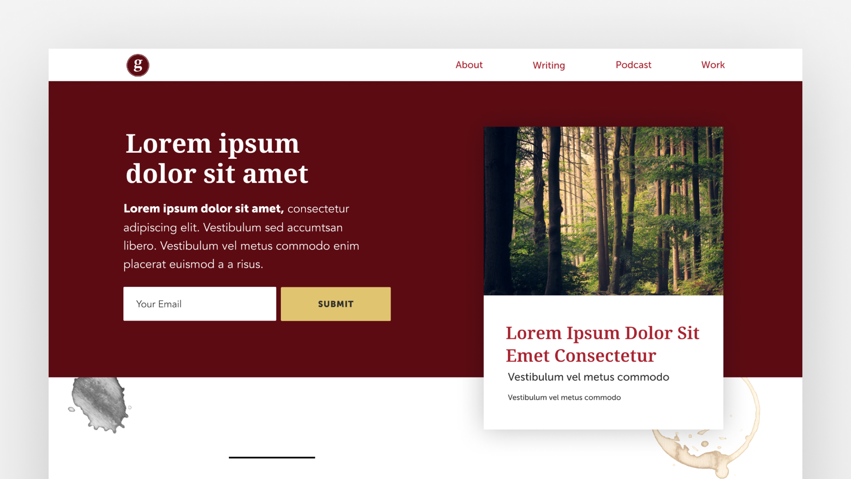
Let’s start by taking a look at the new structure of his site, in particular, the homepage
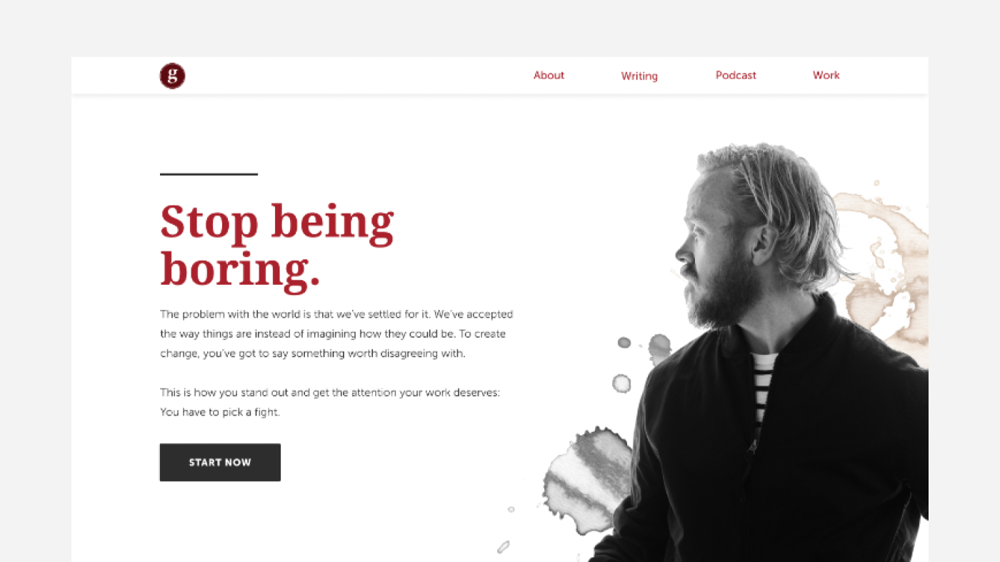
If you’re familiar with Jeff’s work and former brand at all, you’ll instantly recognize that this is a brand new vision. One of clean, creative, positivity that’s perfectly aligned with his business goals.
The stark and welcoming headline. The short copy that brings you further in. The call to action to “Start Now,” which begins your journey into Jeff’s world, with him as your guide. It’s a perfect path to where he wants his audience to go.
And that is followed immediately with an invitation to get to know him better, to subscribe to the podcast, to join the email list, to engage with his content, and more:
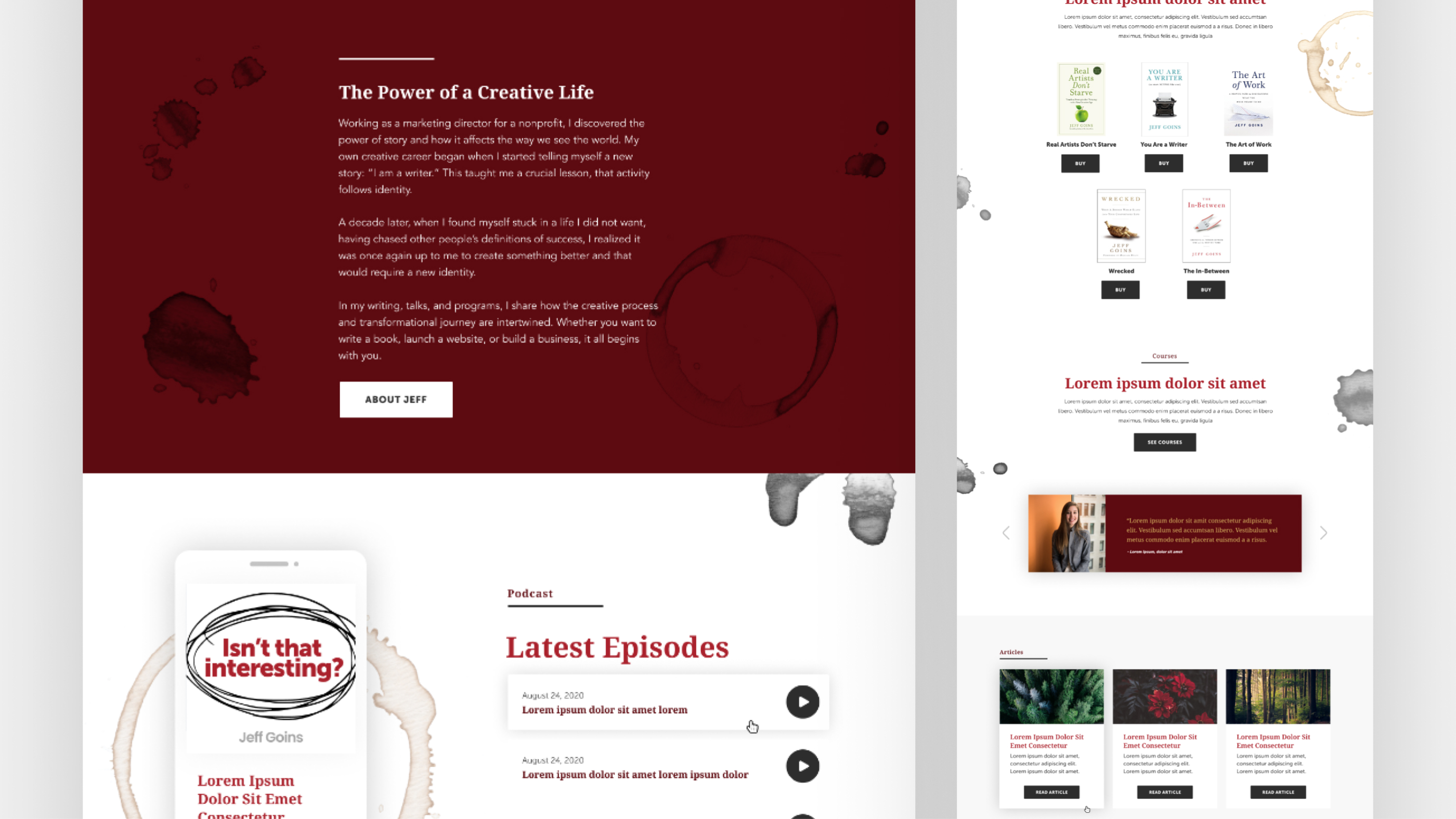
If Jeff’s former website design was reaching out and appealing to a more business oriented visitor, this new vision appeals to that and the more creative oriented, which is not easy to achieve!
Again, the idea here is not to overload the visitor with information, but to strategically place the right information in the right place, excluding nearly everything else. We, with Jeff, decided what was most important, then we presented it clearly.
This process allows the visitor to find exactly what they’re looking for, while simultaneously supporting Jeff’s most important business goals: start here, get to know me, join the email list, follow the podcast, read the blog, buy the books, et cetera.
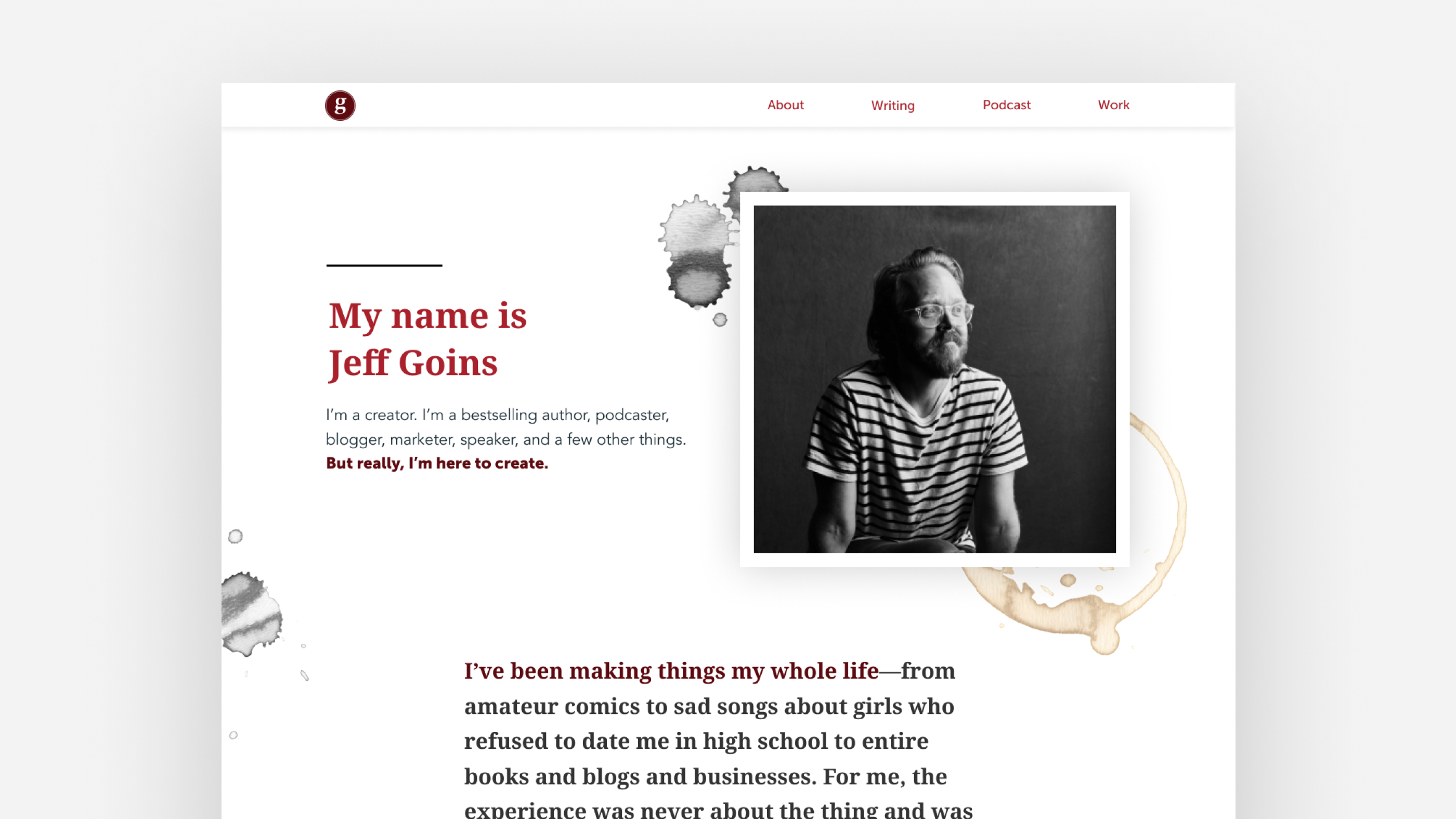
Beyond the homepage, we made decisions about the most important pages that Jeff needed, either in support of click throughs from the homepage and/or as standalone sales pages.
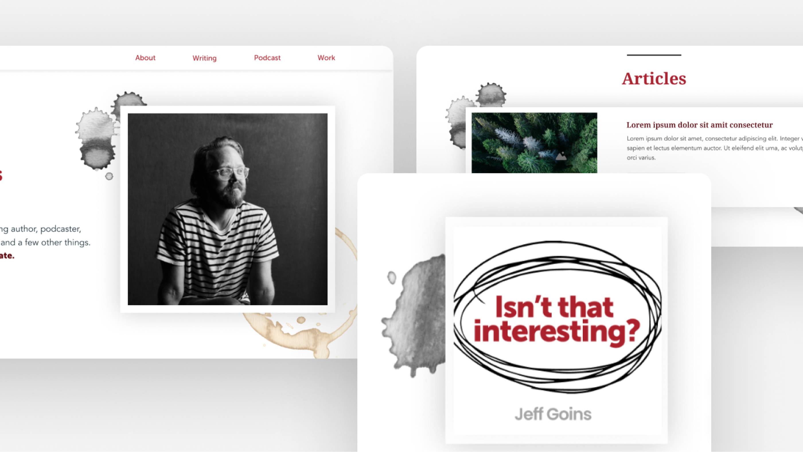
He needed a new About page layout (one of the most important pages on your site!) so that visitors to his site could take one step deeper into his story and offerings, after the homepage:
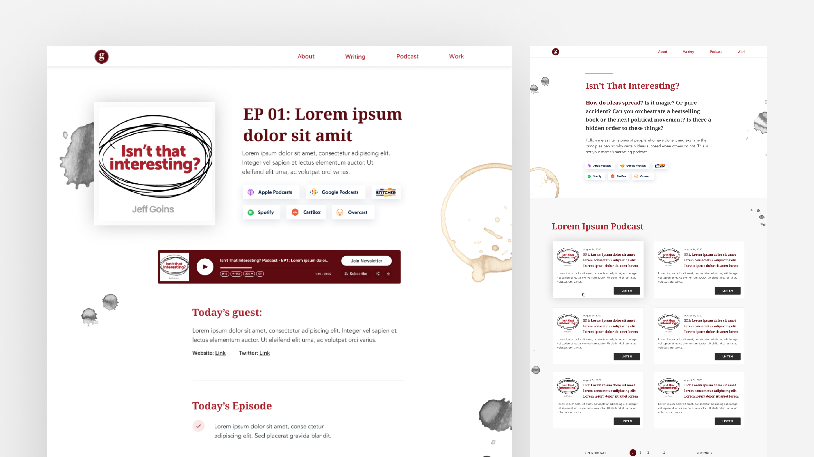
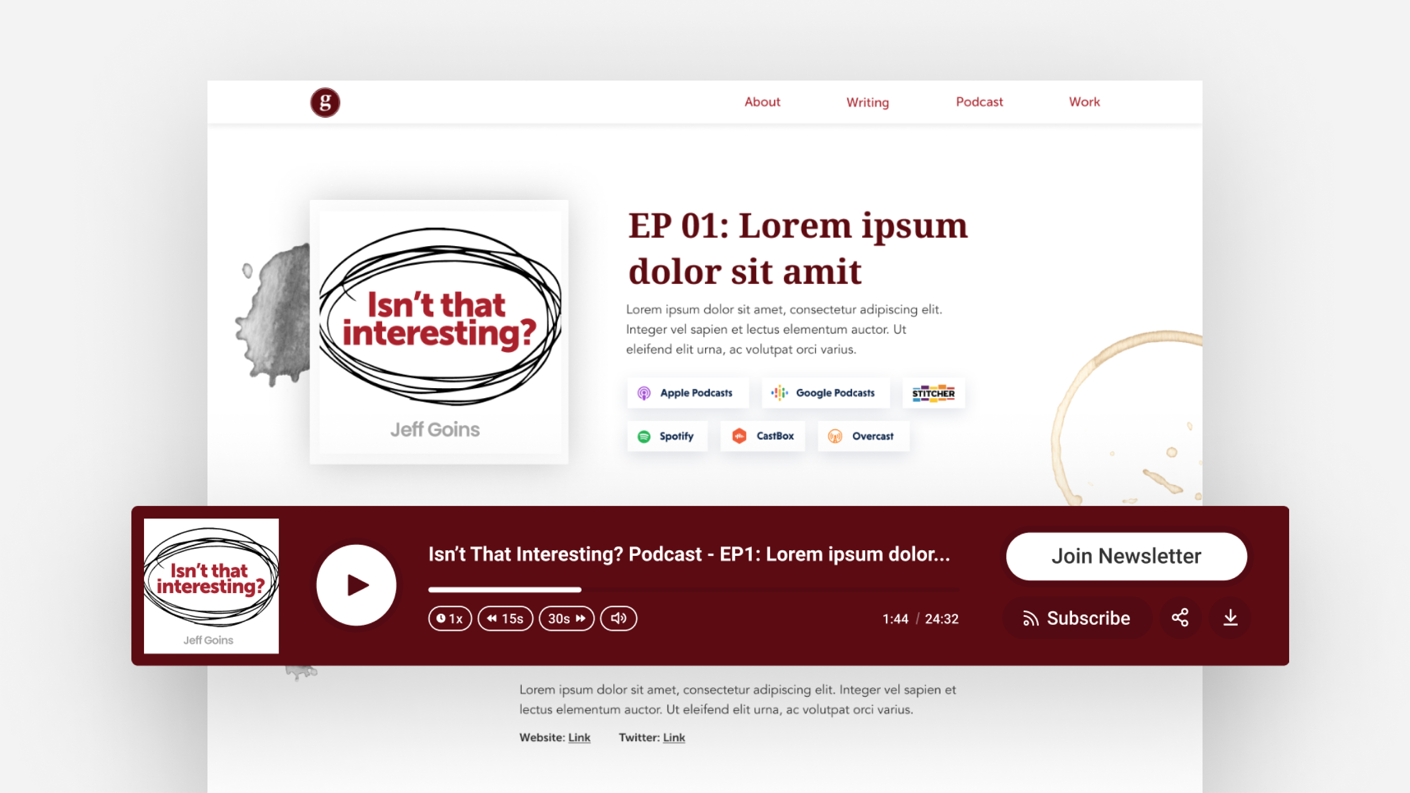
He needed a dedicated podcast page, as well as pages for individual episodes of the podcast:
A dedicated section on the homepage, elegantly displaying his bestselling books:
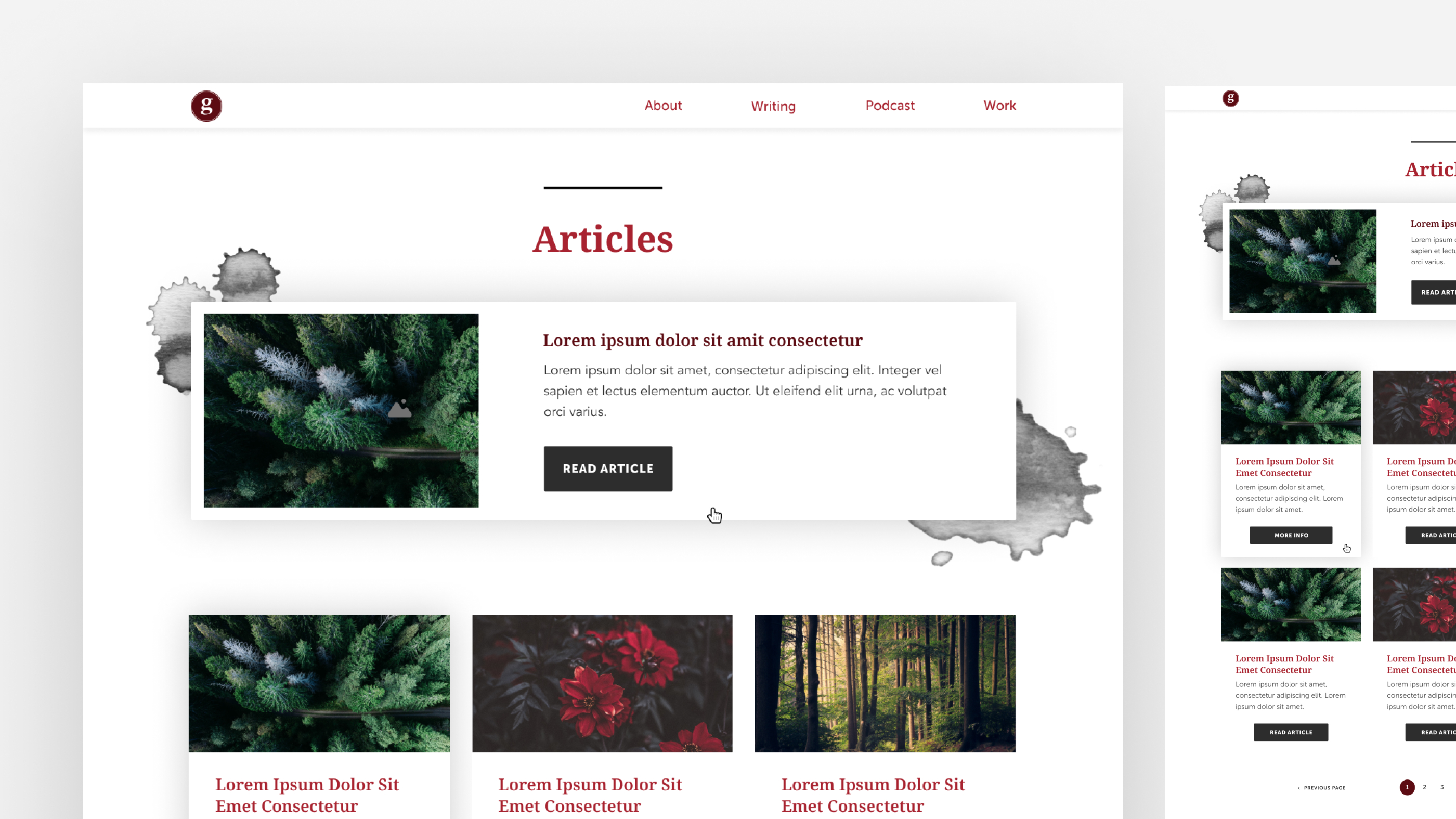
And he needed a reimagined blog archive page, where readers could interact more peacefully with his free content:
There are several other page types we conceived, designed and developed for Jeff as well, but these are the main ones.
Now, let’s spend a moment taking a closer look at the new design and branding we’ve done for Jeff.
Working from our two day long whiteboard sessions with Jeff, as well as extensive research into his personality, offerings, and style, we began to dream up and execute an incredible design framework that included:
- A brand refresh
- A total redesign of his website
In the end, we created several different elements that run throughout the site, here are a number of examples …
A new type-solution logo:

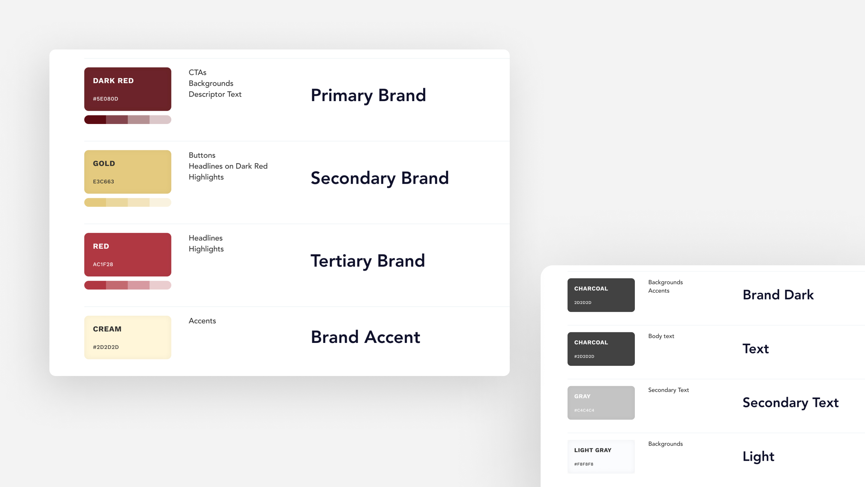
A new color scheme:
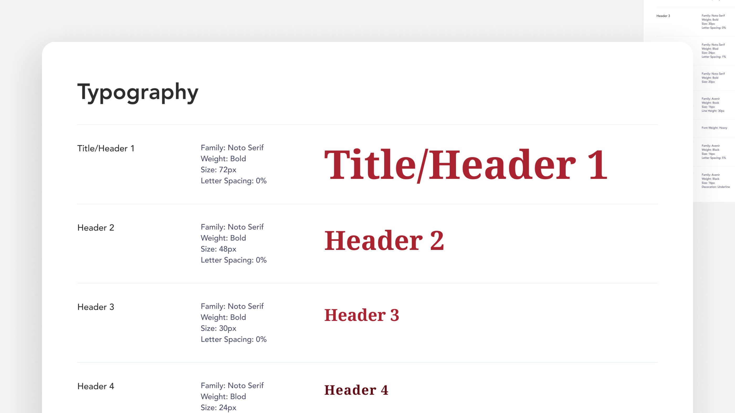
A complete overhaul of his typography:
100% Mobile Responsiveness:
Branded accents that run throughout different elements on the site:
A custom podcast player (via Fusebox):
We’re grateful to have been able to work with a creative force like Jeff. He is good people. And now, his reimagined vision for his future — and that of his audience — is ready to go forward, as far as they can take it.
Check out the rest of Jeff’s site right now at
We’re grateful to have been able to work with a creative force like Jeff. He is good people. And now, his reimagined vision for his future — and that of his audience — is ready to go forward, as far as they can take it.
Check out the rest of Jeff’s site right now at goinswriter.com.
.
